How to Create a Calm Color Palette Without Making Your Home Feel Blah
When people hear “calm home,” they often picture all-white rooms, flat beige walls, and spaces that feel more like a showroom than a place to live. But a calm home doesn’t have to be boring — and it definitely doesn’t have to be colorless.
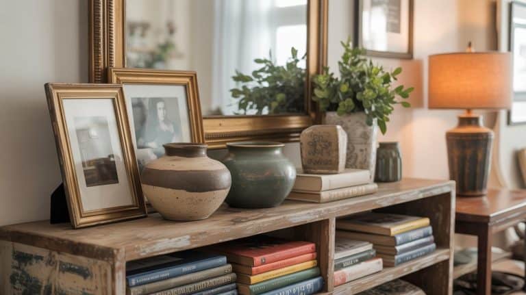
The secret isn’t avoiding color. It’s choosing soft, earthy tones, layering texture, and letting colors feel grounded instead of loud. A calm color palette should feel warm, lived-in, and supportive — not stark or sterile.
Below are seven designer-inspired color palettes that bring calm and character into a home, using warm neutrals, muted color, and plenty of texture.

What Makes a Color Palette Feel Calm
Before diving into specific palettes, here’s the simple rule I always come back to:
Calm comes from muted tones + warmth + texture.
That means:
- Choosing colors with a soft, dusty quality (not high-contrast brights)
- Pairing color with natural materials like wood, linen, and stone
- Letting texture do some of the work instead of relying on bold color alone
You don’t need to repaint your whole house. One thoughtful palette in one room can change how your entire home feels.
BETTER PROMPTS BELOW
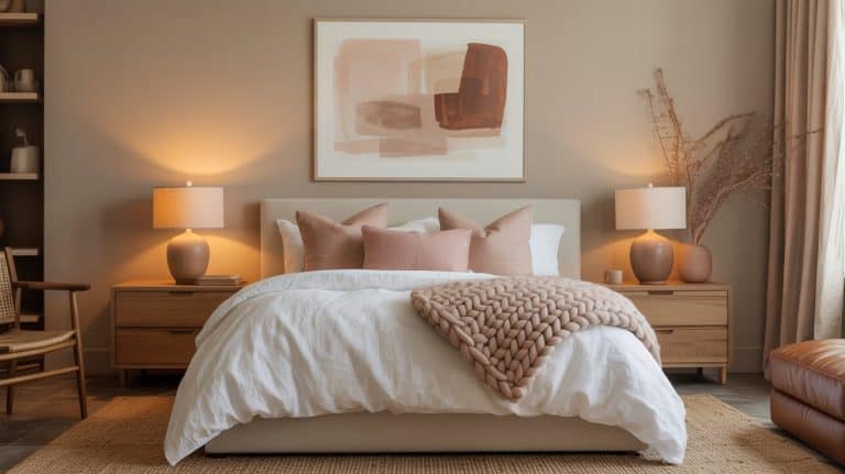
Palette 1: Warm White + Soft Clay + Natural Wood
Vibe: grounded, timeless, quietly cozy
This palette is a slow-living staple. The warmth of white paired with clay tones and wood creates a space that feels clean but never cold.


Palette 2: Soft Greige + Olive Green + Brass
Vibe: calm with quiet depth
Greige creates the perfect neutral base, while olive green adds an earthy richness that still feels peaceful.


Palette 3: Muted Beige + Clay + Soft Sage
Vibe: Calm, but uplifting
This may be at the top of my favorite color palettes. It has such a relaxing neutral feel, but at the same time seems colorful and inviting.

Need some help selecting the best paint color for your new calm home? Jump to our paint recommendations at the end of this article.

Palette 4: Sand + Muted Blue + Warm White
Vibe: airy, relaxed, spa-like
This palette brings calm through gentle contrast — never sharp, never busy.


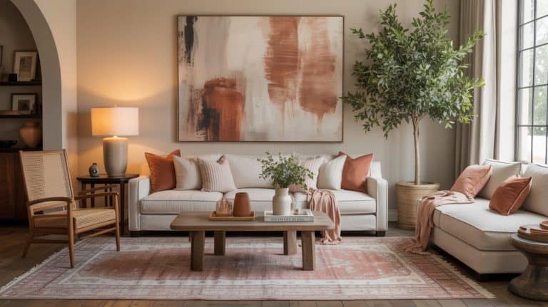
Palette 5: Warm Taupe + Terracotta + Cream
Vibe: earthy, comforting, slow-living warmth
Terracotta adds life without noise, especially when paired with taupe and cream.


Need some help deciding on the best calming paint colors? Jump to our paint recommendations at the end of this article.
Palette 6: Soft Charcoal + Linen White + Natural Texture
Vibe: calm, grounded, quietly dramatic
Dark doesn’t have to feel heavy — softness is key.


Palette 7: Soft Sage Green + Warm White + Light Wood
Vibe: fresh, natural, emotionally calming
Sage green is one of the most calming colors you can use — especially when muted.


Palette 8: Blush + Warm Beige + Soft Brown
Vibe: gentle, comforting, quietly romantic
Blush doesn’t have to feel sweet or trendy when it’s muted and balanced.


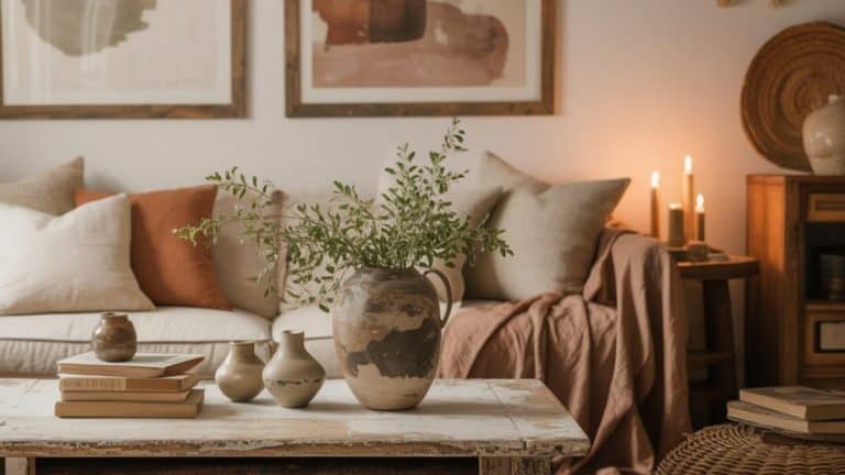
More Calming Color Palettes
Using a combination of the colors above, here is some more inspo for you!


How to Choose the Right Palette for Your Home
Start with how you want the room to feel:
- Restful
- Grounded
- Cozy
- Airy
Then choose:
- One main neutral
- One soft, earthy accent
- Plenty of texture
You don’t need to commit to everything at once. One room is enough.
A Few Favorite Calm Home Paint Colors (Tried-and-True)
If choosing paint colors feels overwhelming, this is a gentle place to start. These shades consistently show up in calm, slow-living homes because they’re warm, soft, and easy to live with — not stark, trendy, or overly bold.
Creamy, Warm Whites
These work beautifully as whole-home colors or in spaces where you want light without feeling cold.
- Alabaster – Sherwin-Williams
A warm, creamy white that feels soft and welcoming in almost any light. - White Dove – Benjamin Moore
A classic off-white with just enough warmth to avoid feeling stark. - Swiss Coffee – Behr
Cozy and approachable, perfect for living rooms and bedrooms.
Soft Clay & Terracotta Tones
These add warmth and character without overpowering a space.
- Redend Point – Sherwin-Williams
A muted clay tone that feels earthy and grounded, not bold or trendy. - Faded Terracotta – Benjamin Moore
A softened terracotta that pairs beautifully with wood and linen textures.
Warm Taupes & Greige Neutrals
Ideal if you want depth while keeping things calm and flexible.
- Accessible Beige – Sherwin-Williams
A warm greige that works in many rooms and lighting situations. - Edgecomb Gray – Benjamin Moore
Light, warm, and versatile — especially beautiful with natural textures.
You don’t need to find the perfect color. Calm homes are built on tones that feel supportive and easy to live with — colors that don’t demand attention but quietly hold the space together.
If You Want a “Safe” Whole-Home Paint Color
If you don’t want to overthink paint choices — and just want something that works almost everywhere — a warm neutral is your best friend. These shades flow beautifully from room to room, adapt to different lighting, and pair easily with wood, stone, linen, and earthy accents.
A few tried-and-true favorites designers often recommend as whole-home colors:
- Accessible Beige – Sherwin-Williams
This is likely the color you’re thinking of. It’s not too beige, not too gray — just a warm, balanced neutral that works in open floor plans and transitions well between rooms. It’s consistently popular and expected to stay relevant well into 2026 because of its softness and versatility. - Shoji White – Sherwin-Williams
A creamy, slightly warm white that feels gentle rather than stark. Ideal if you want a lighter home overall but still want warmth and depth. - Edgecomb Gray – Benjamin Moore
A light greige that reads warm and calm in most lighting. Great if you want something neutral but with a bit more presence than white. - Natural Linen – Sherwin-Williams
A warm neutral that leans slightly earthy, making it a beautiful backdrop for slow-living spaces with texture and natural materials.
If you’re unsure, the safest approach is this:
Choose one warm neutral for most of the home, then layer in personality through texture, art, textiles, and small color accents. That way, your walls stay calm and flexible — and your home can evolve without repainting every year.
Calm homes don’t chase trends. They choose colors that feel good to live with — day after day.
Final Thoughts
A calm color palette isn’t about playing it safe — it’s about choosing colors that support you. When you layer warmth, texture, and muted color, your home feels softer, steadier, and easier to live in.
Calm doesn’t come from avoiding color.
It comes from choosing it intentionally.